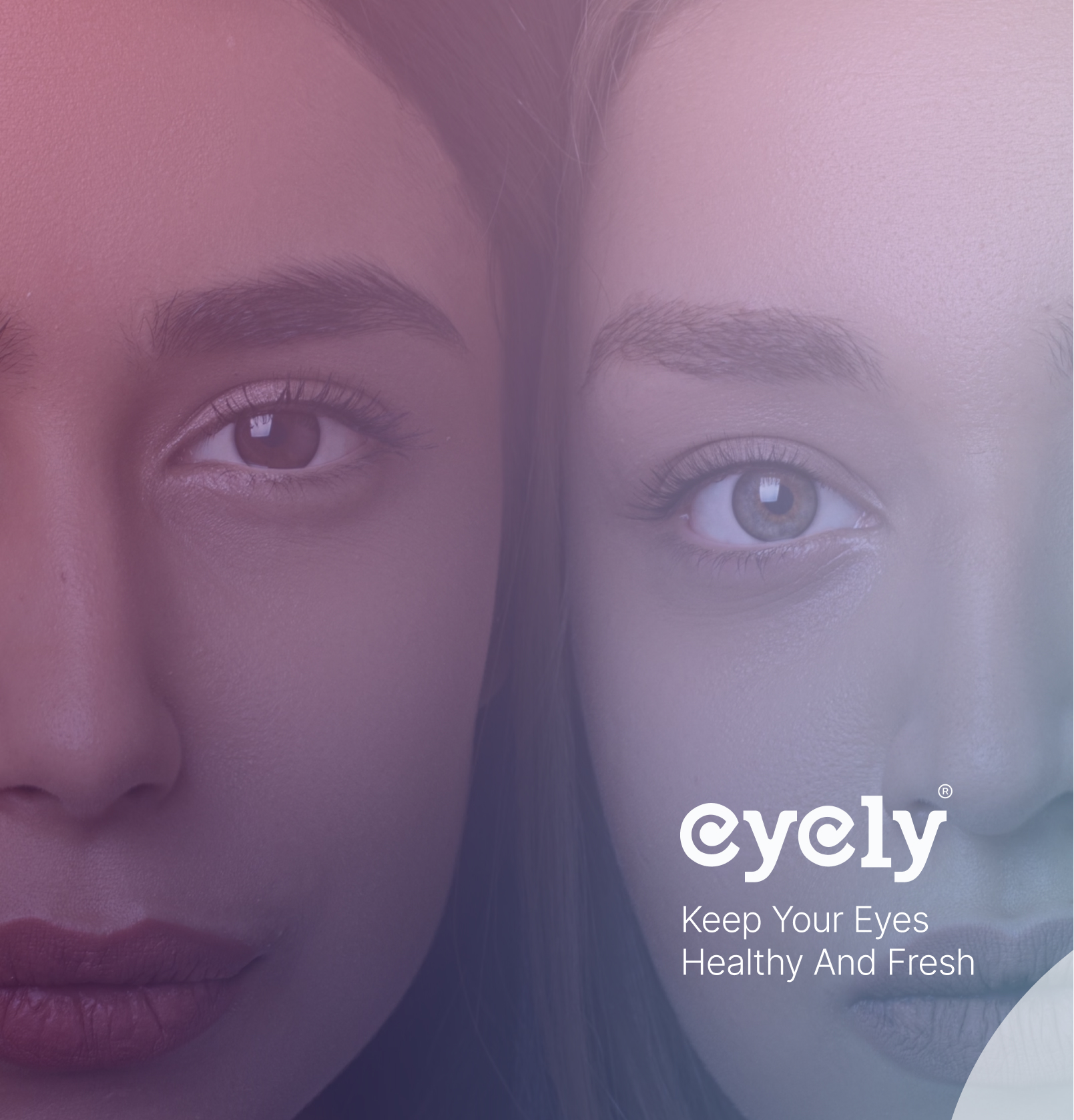
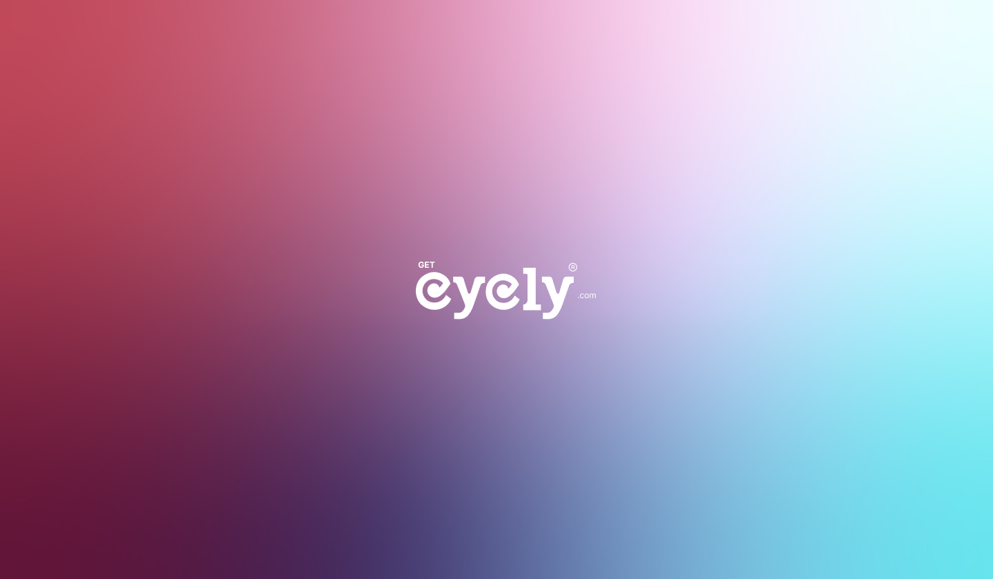
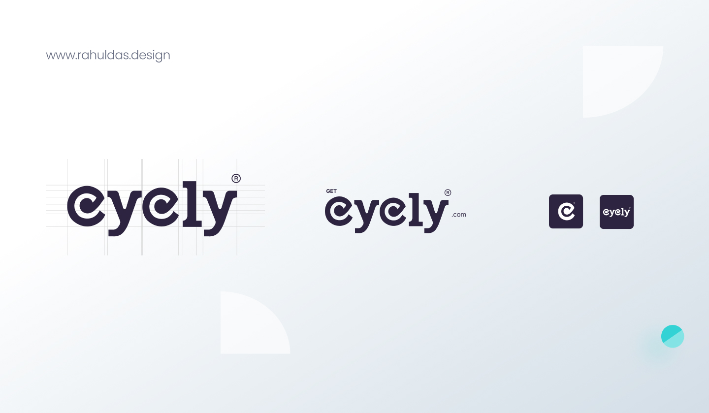
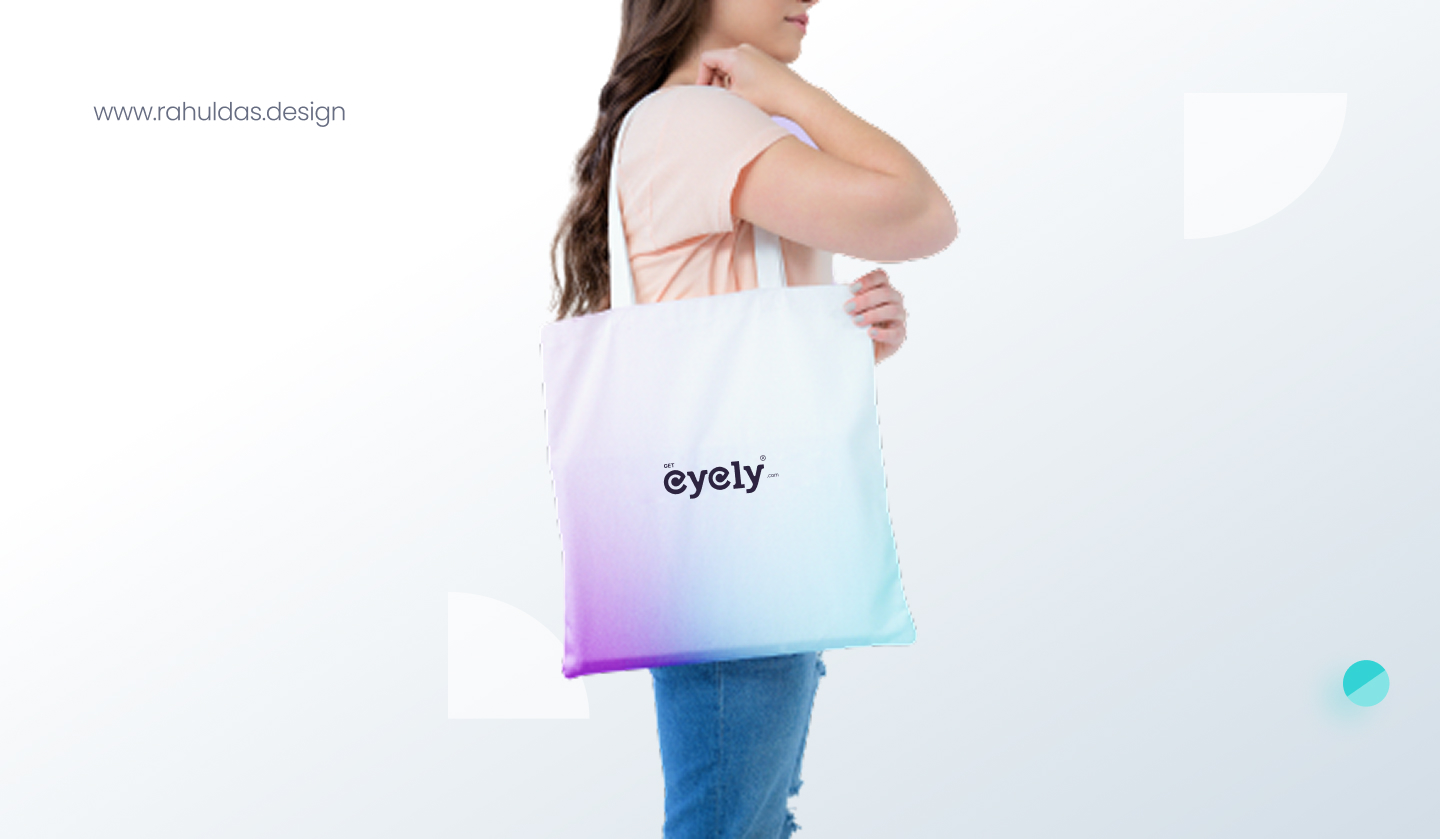
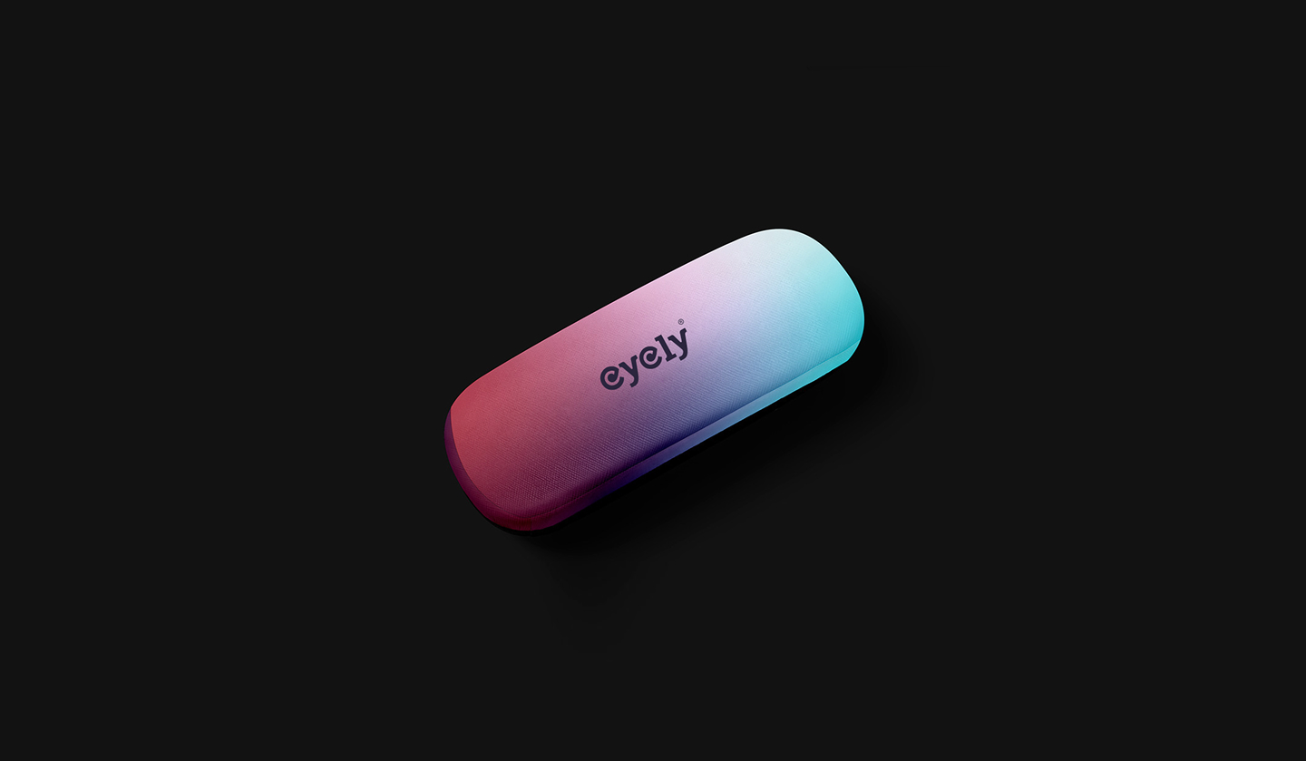
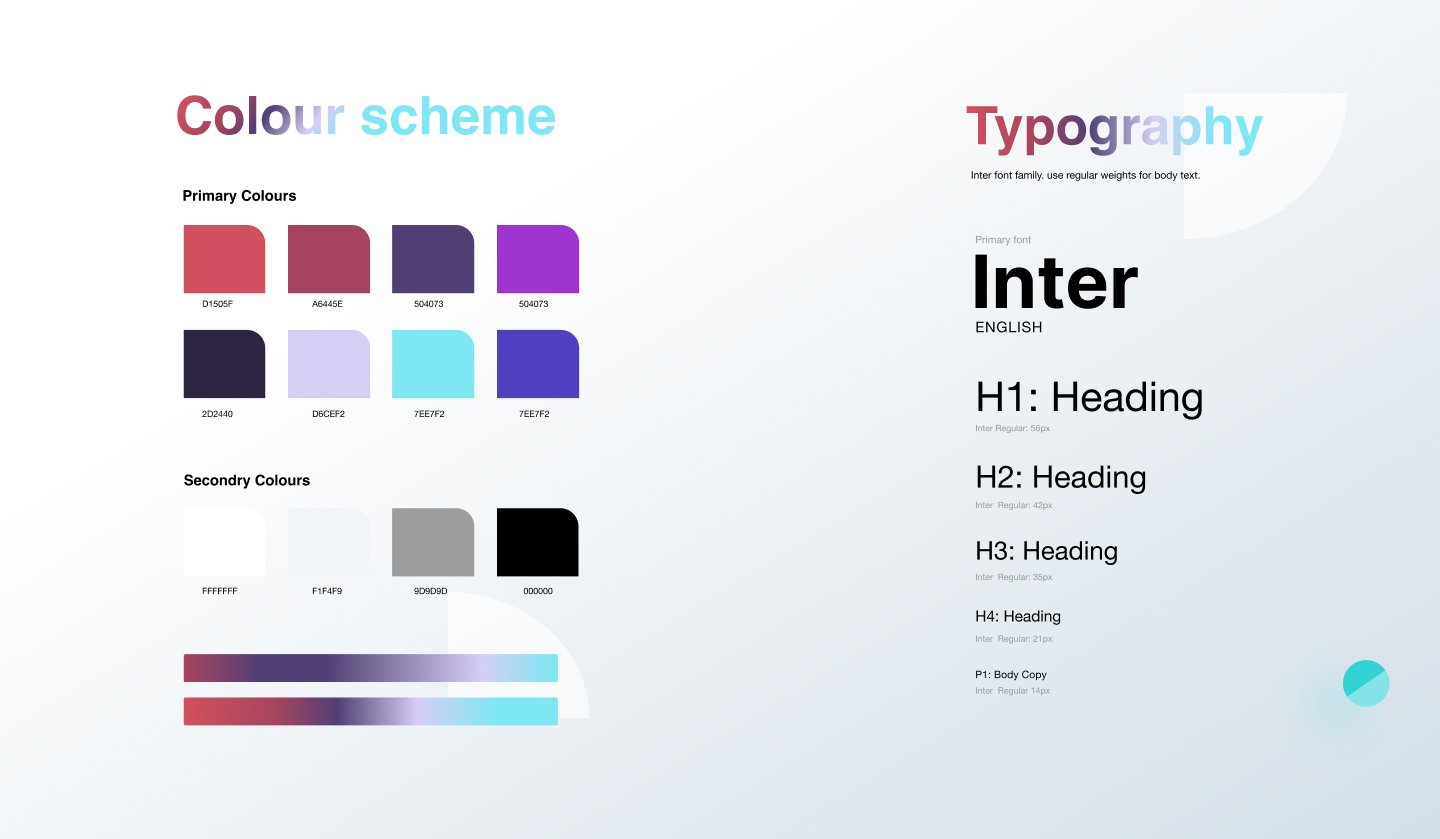
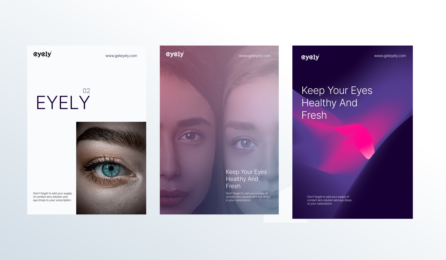
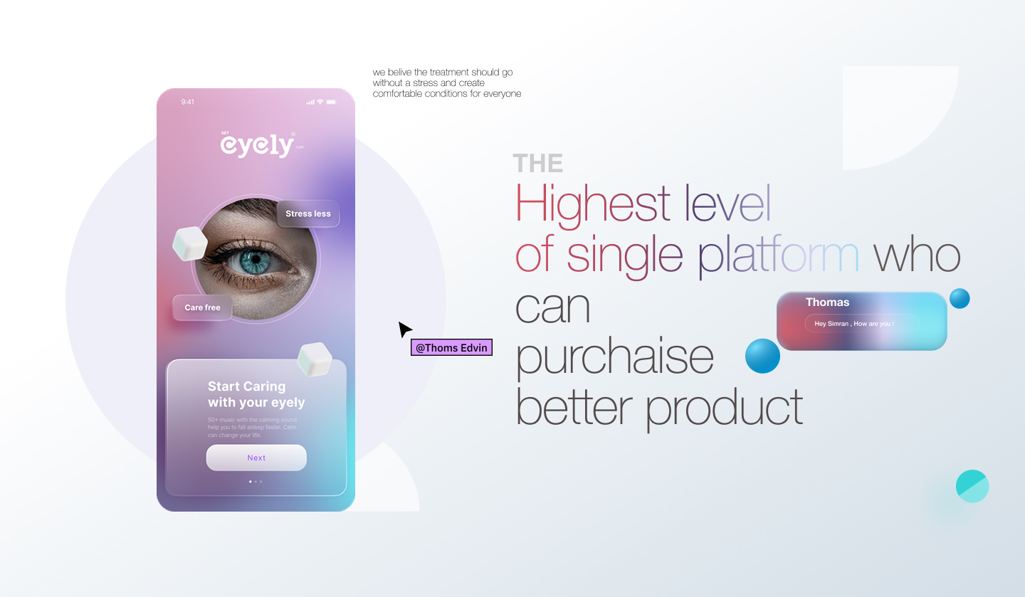
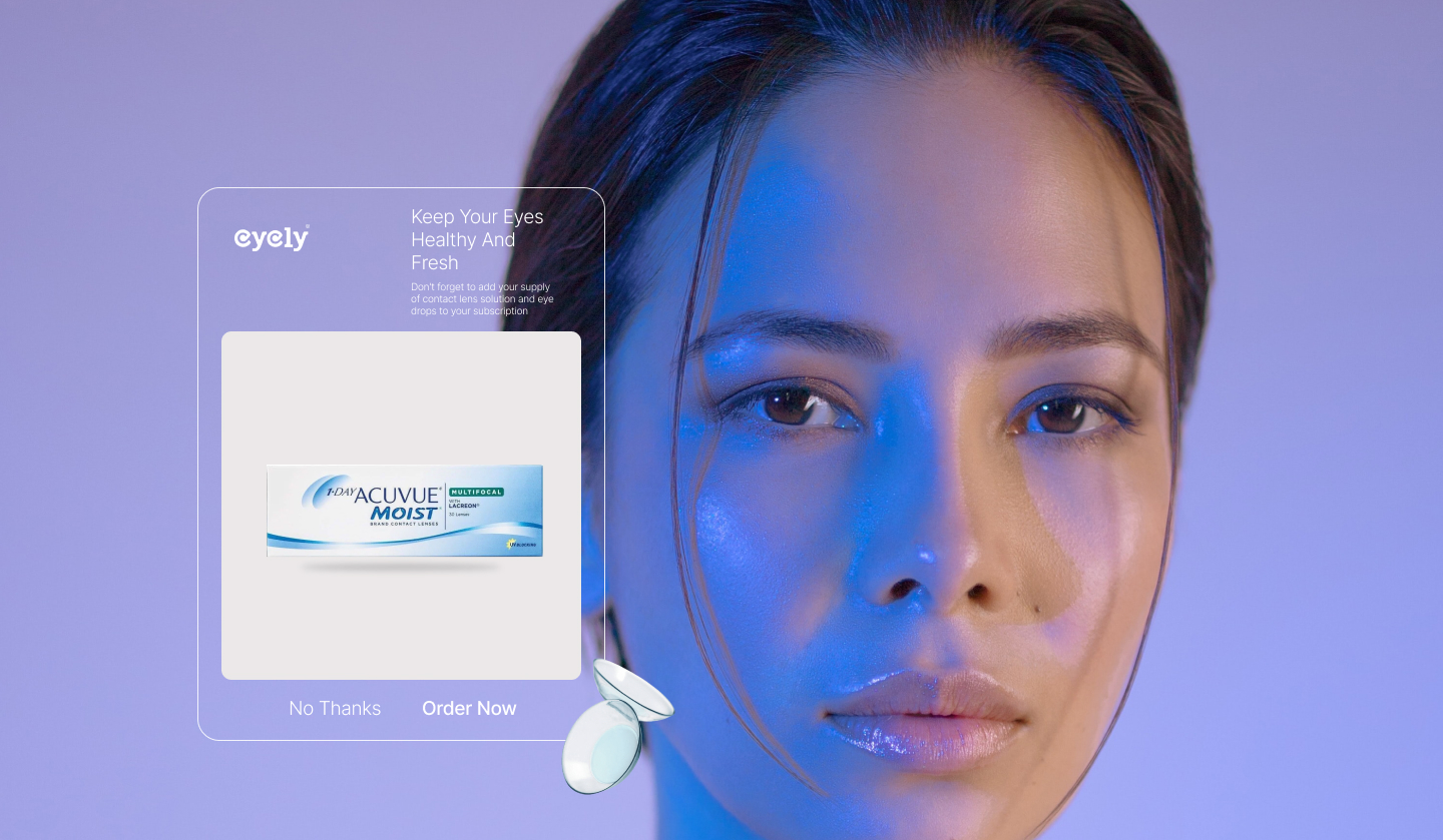
The branding for Eyely was designed to feel calm, gentle, and instantly likable, reflecting the sensitive and personal nature of eye care. As an optical and eye-lens–focused brand, the visual identity needed to communicate trust, comfort, and clarity without visual noise. The logo and overall brand system follow a minimal approach, allowing softness and simplicity to guide every design decision. Typography plays a central role in shaping the brand personality, with clean letterforms, balanced spacing, and smooth curves that subtly echo the form and function of the human eye. The custom wordmark is intentionally understated, designed to feel modern yet friendly, ensuring it remains approachable across all age groups. The visual language extends this philosophy through restrained color usage, soft gradients, and light compositions that evoke freshness and visual ease. Rather than overpowering the product, the design creates space—letting the eyewear and the user’s experience take focus. Every element, from logo construction to layout rhythm, was crafted to reduce cognitive effort and enhance visual comfort. Eyely’s branding positions the product as an everyday essential—effortless, reliable, and seamlessly integrated into daily life—while maintaining a contemporary and premium presence.