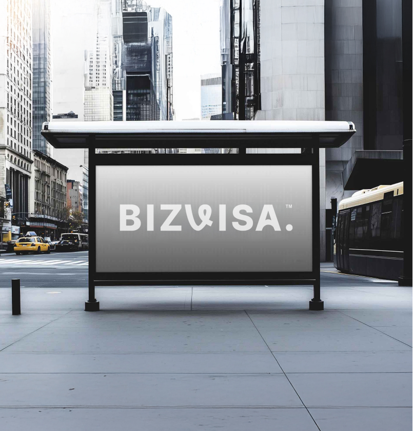
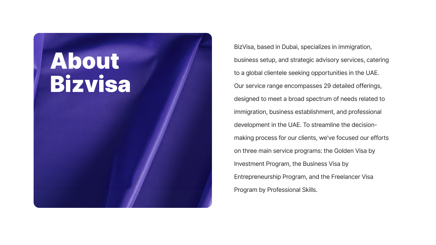
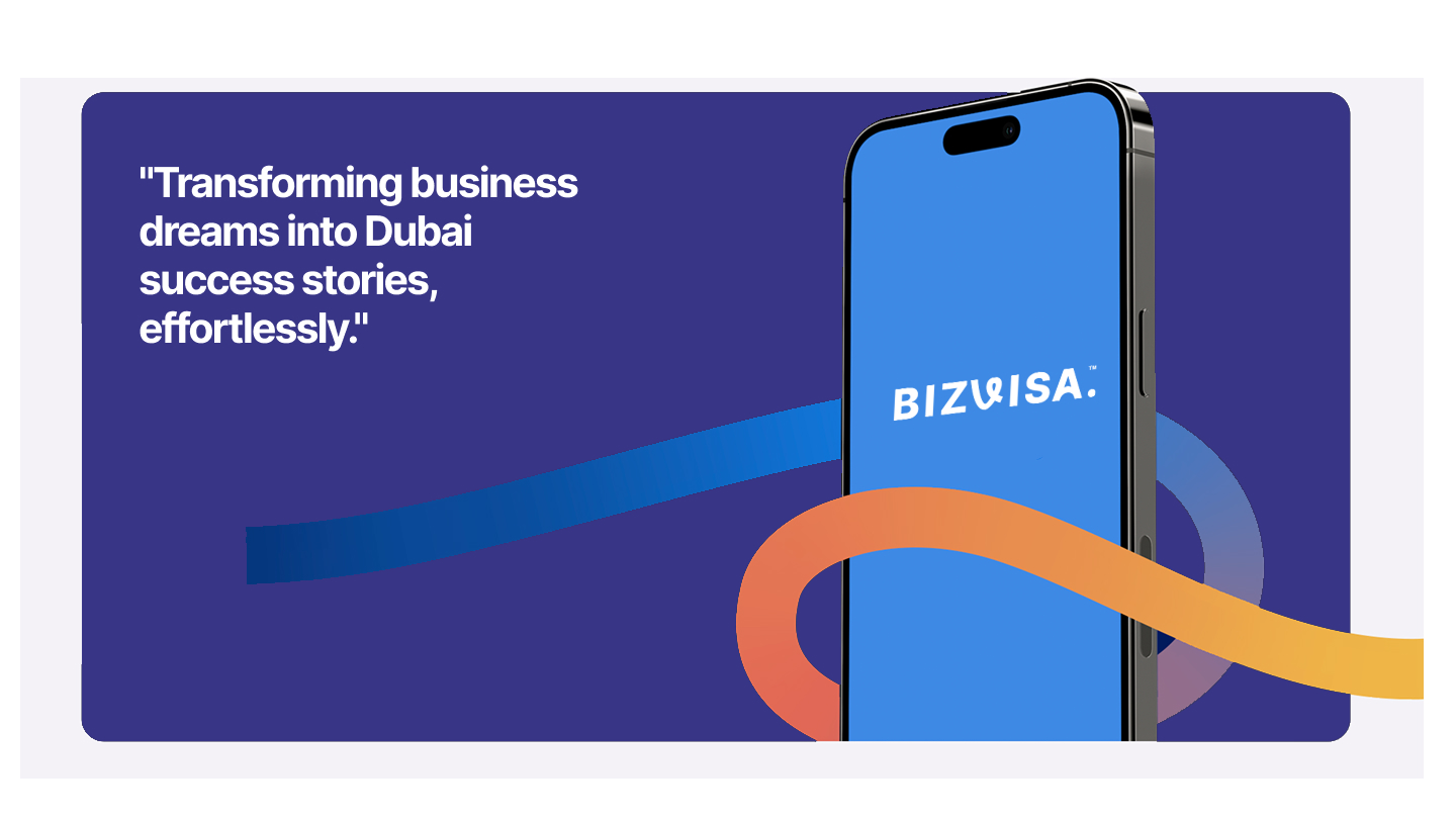
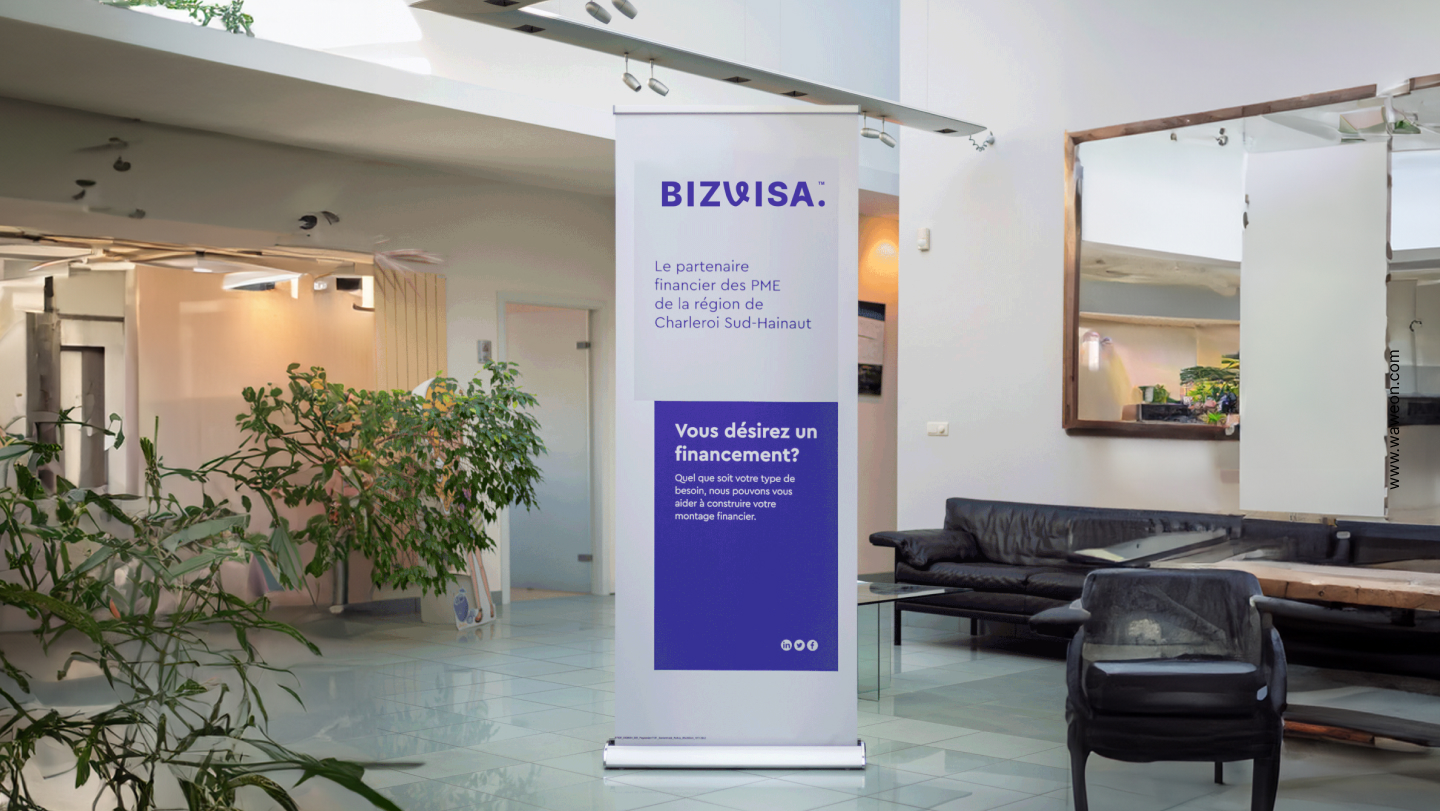
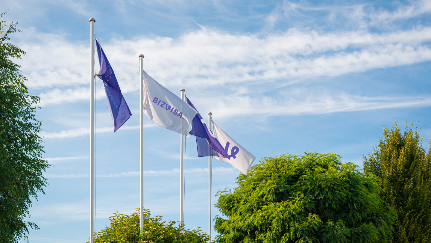
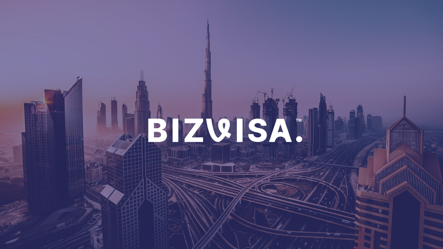
BizVisa is a Dubai-based immigration and business advisory brand serving a global audience seeking opportunities in the UAE. The brand specializes in immigration, business setup, and strategic advisory services, offering a wide range of solutions that are streamlined into three core programs: the Golden Visa by Investment Program, the Business Visa by Entrepreneurship Program, and the Freelancer Visa Program by Professional Skills. The branding was designed to reflect trust, clarity, and long-term vision—key qualities essential for clients making life-changing decisions.
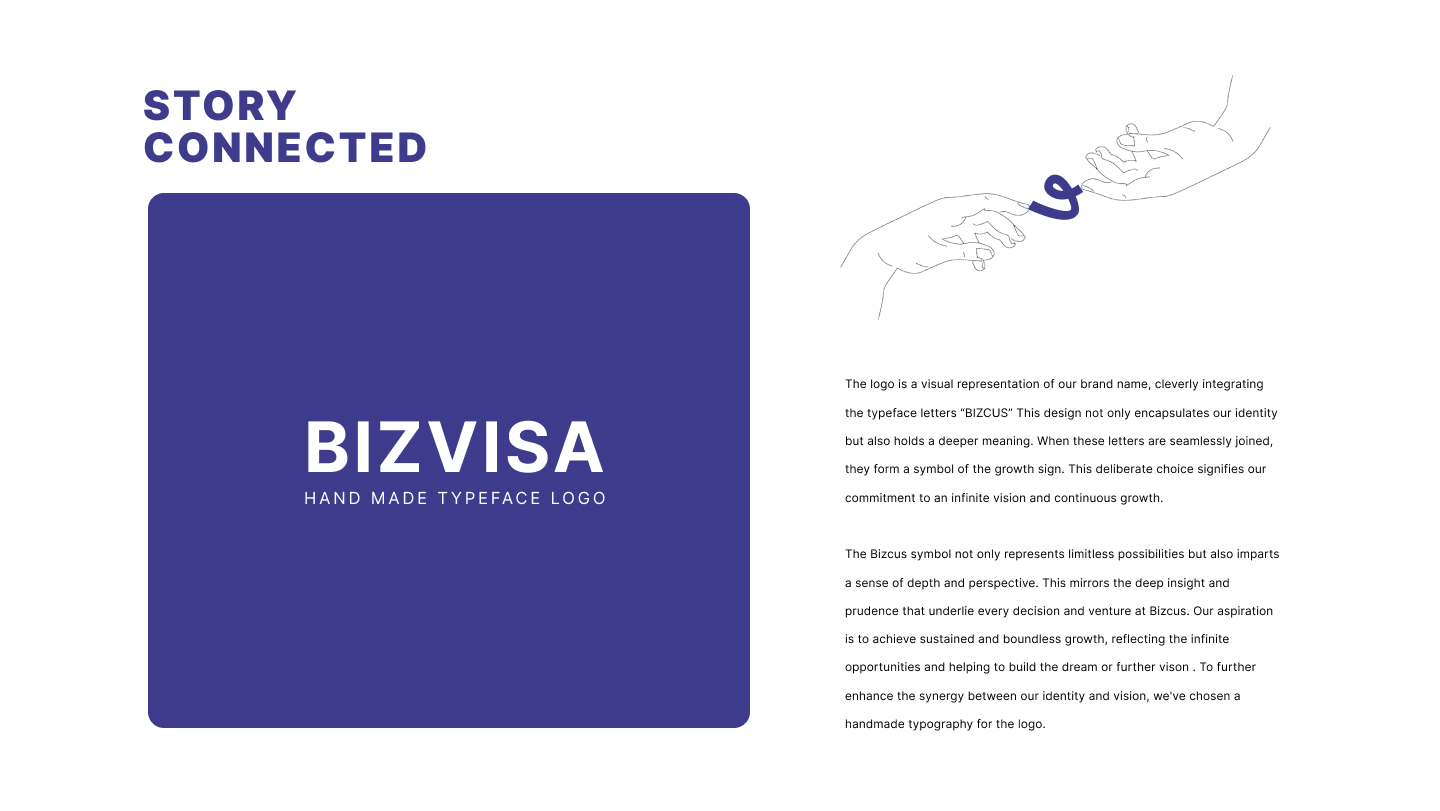
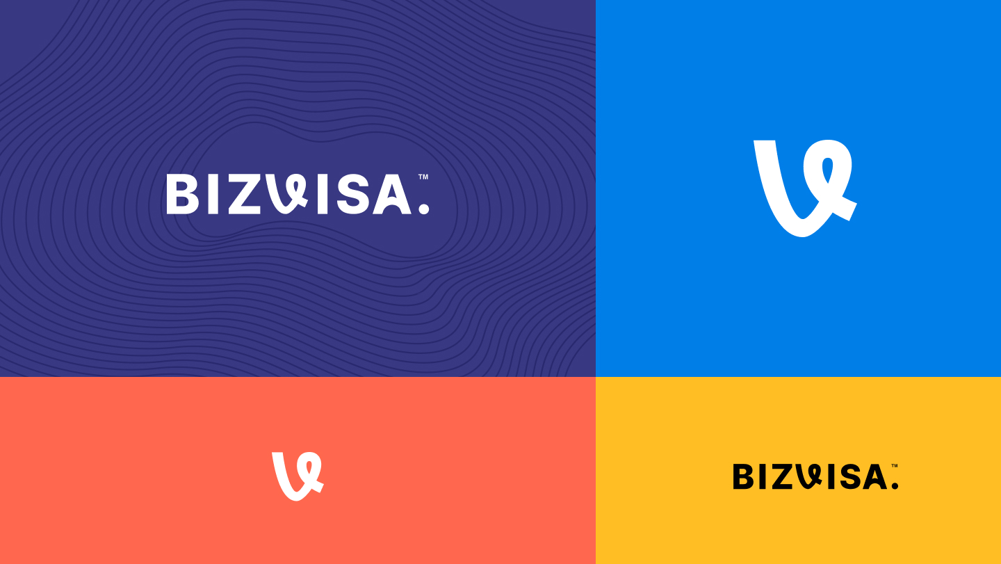
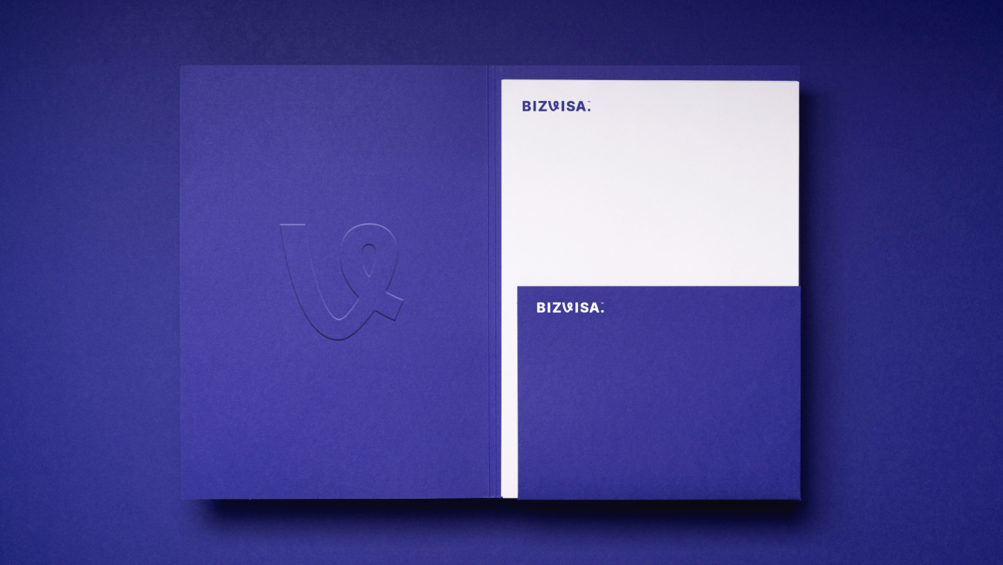
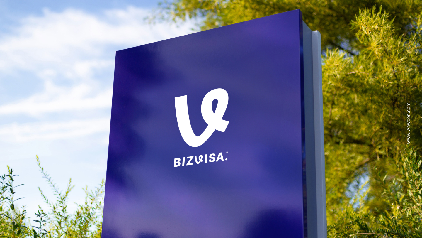
The logo concept is a visual interpretation of the brand’s ambition and philosophy. Built around the brand name Bizcus, the custom typography integrates the letterforms in a seamless, continuous structure. When combined, these forms subtly create a growth symbol, representing progress, upward movement, and infinite potential. This intentional design choice reflects the brand’s commitment to continuous growth and forward momentum. The symbol also introduces depth and perspective, mirroring the insight, foresight, and strategic thinking that guide every BizVisa engagement. To strengthen authenticity and distinction, a handmade typographic approach was chosen—giving the logo a human, confident, and trustworthy character while reinforcing the brand’s vision of building futures and unlocking limitless opportunities.